If you aren’t among the many genealogists who are on Facebook, you have missed a fun project going around. My California friend, J. Paul Hawthorne, created a template in Excel on which you add the birth state or country for you and your first four ancestral generations. I added county names to mine and in a couple cases, the city.
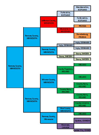 I saw a few charts where others had added additional generations. Other people have gone a different direction and instead of places of birth, have used the chart to depict the religion at birth.
To create your own, visit this link http://bit.ly/1RjfZEZ, replace Paul’s statesand countries with your own and modify the colors so that all of one state or country are the same color, and it’s easy to print or use the snipping tool if you want to copy it in a format such as jpeg.
Have fun!
© 2016, Paula Stuart-Warren. All rights reserved.
I did figure it out, Paula. It was a tool I didn’t even realize I had. Thanks.
What a great idea. I didn’t realize how much I was wanting this exact system!
Thanks for sharing, Paula. And thanks to J. Paul for creating. It a wonderful way to take another look at a pedigree chart.
One question — how do you share your results? I have an old system and all I can do is either cut & paste into a WORD doc or save as a PDF — neither of which translates as neatly into FB.
Did you get it figured out, Terri? I used the snipping tool that is a neat tool from MS Windows.
I love your chart, Paula! I’m glad everyone is sharing. Thanks for the shout out!